• Visual Identity • 2026
TILLIT
A visual system designed to make complex data feel more human
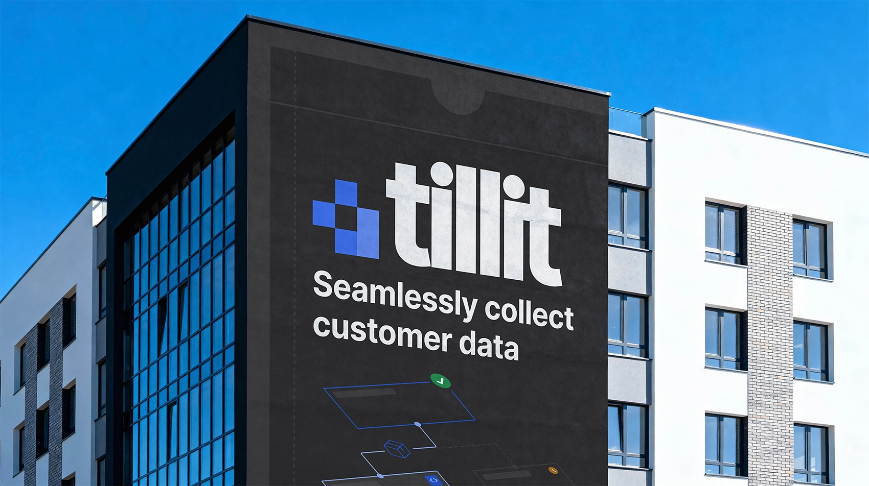
Making complexity feel human
Tillit is an international platform for product registration and managing complex product data.
My role was to take ownership of the visual design process, from early concept development to the final visual system, including logo, typography, color principles and reusable design elements. I worked with Jungle Design as stakeholders throughout the project, using workshops, feedback sessions and iterations to shape the direction.
The challenge was balancing a complex data-driven platform with an identity that felt trustworthy and structured without becoming cold or overwhelming.
Between structure and warmth
Through workshops exploring tone, associations and visual positioning, I developed several possible directions for the identity. The purpose was to explore different ways of balancing structure, warmth and trust.
The final direction combined two approaches: the structure and clarity from Structured & Logical with the sense of trust and stability from Safe & Serious. More playful expressions were removed to maintain a sense of control, precision and trust.
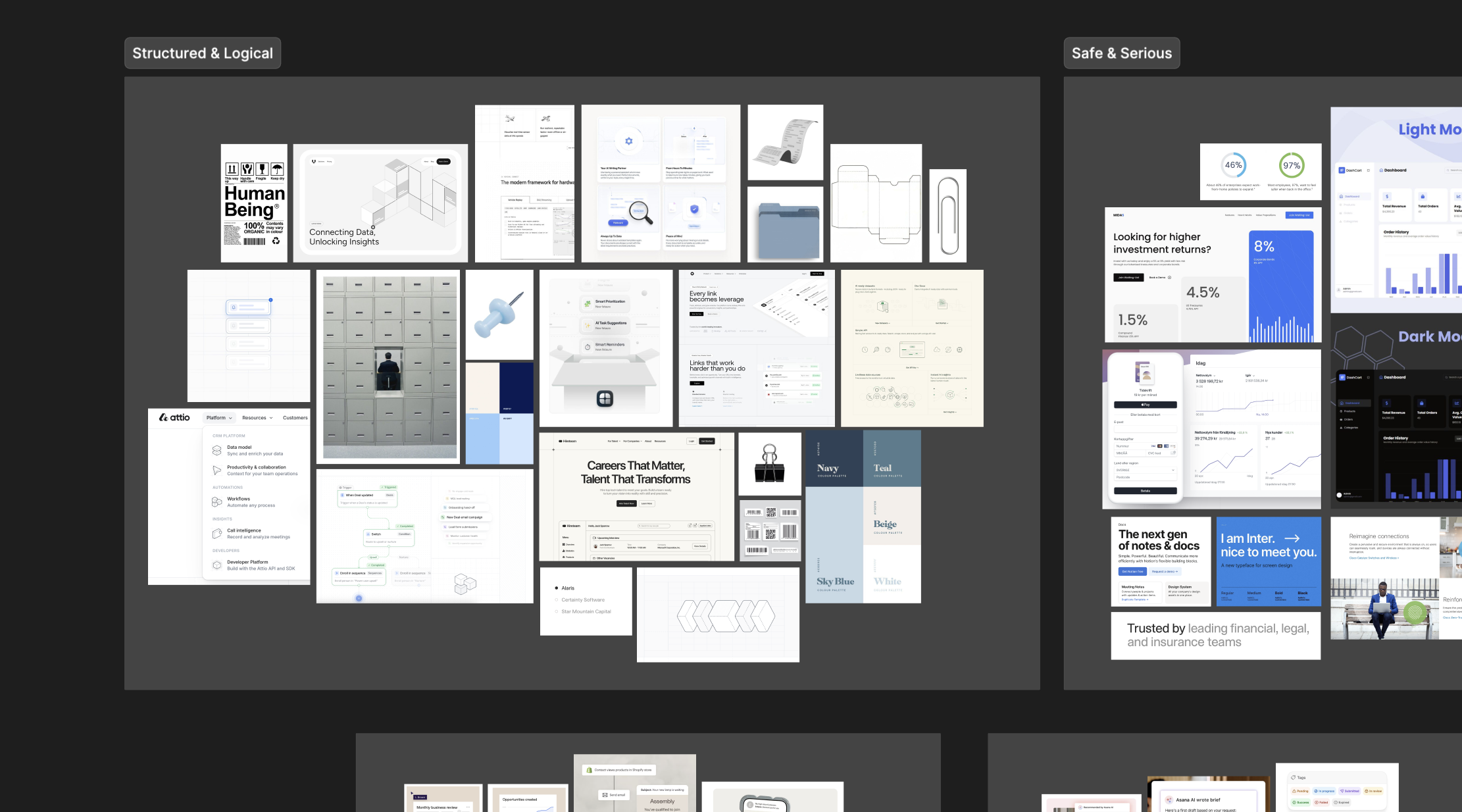
Several visual directions were explored to find the right balance between technical precision and human presence.
Packaging as a metaphor
Packaging became both a metaphor and a visual reference throughout the identity. The design system is built around framing, modularity and subtle references to packaging design.
- Packaging construction
- Grid systems
- Modules
- Fold lines and assembly markings
Packaging carries the product.
Tillit carries the data.

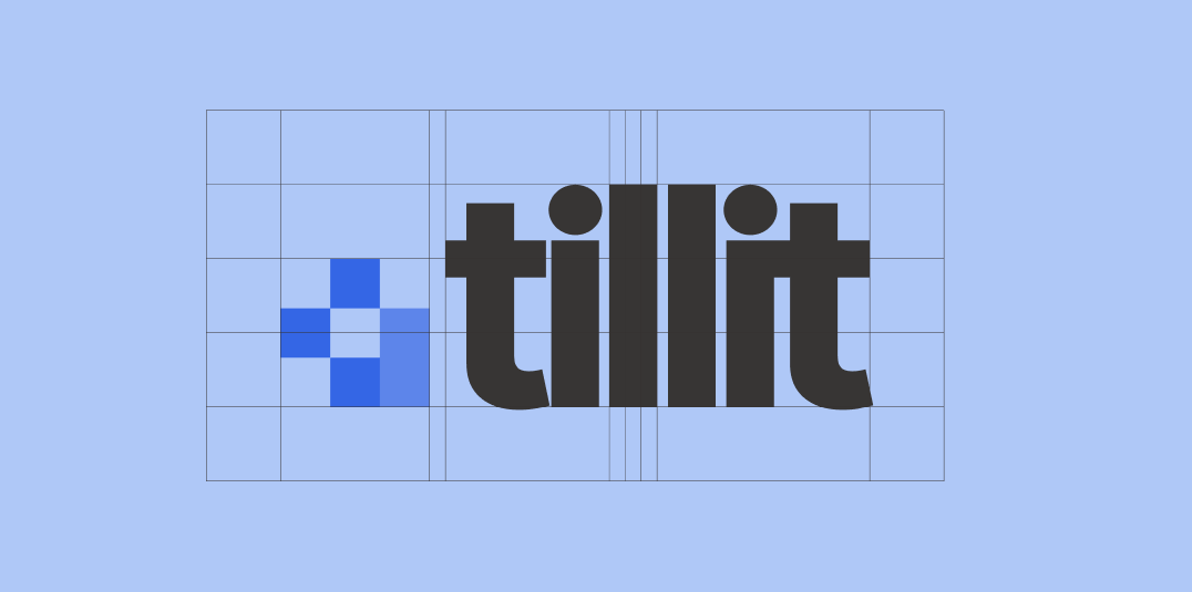
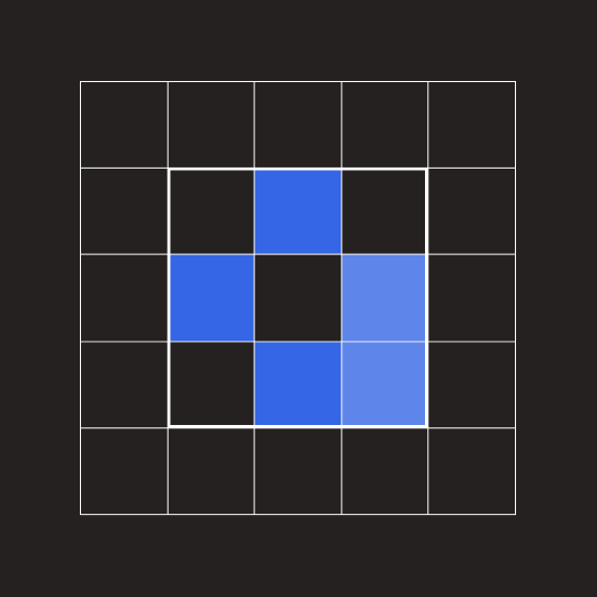
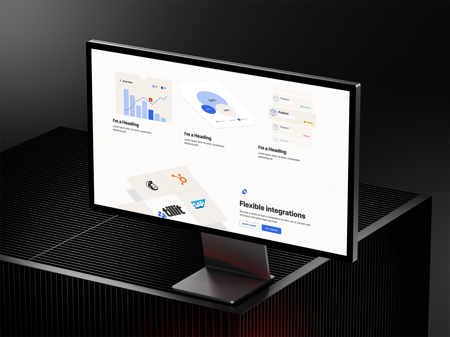
A system built from modules
To avoid creating a static identity, I developed a flexible system that could adapt across different parts of the product. The logomark was built from modular shapes, where the same building blocks are repeated across patterns, graphs and UI elements.
The geometric structure was balanced with softer shapes in the wordmark to create a more approachable and human contrast.

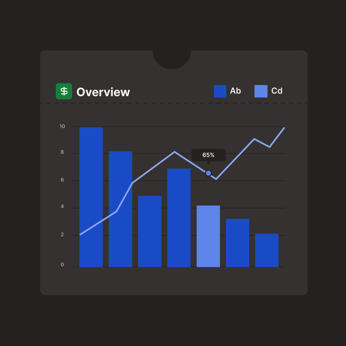
Where warmth meets data
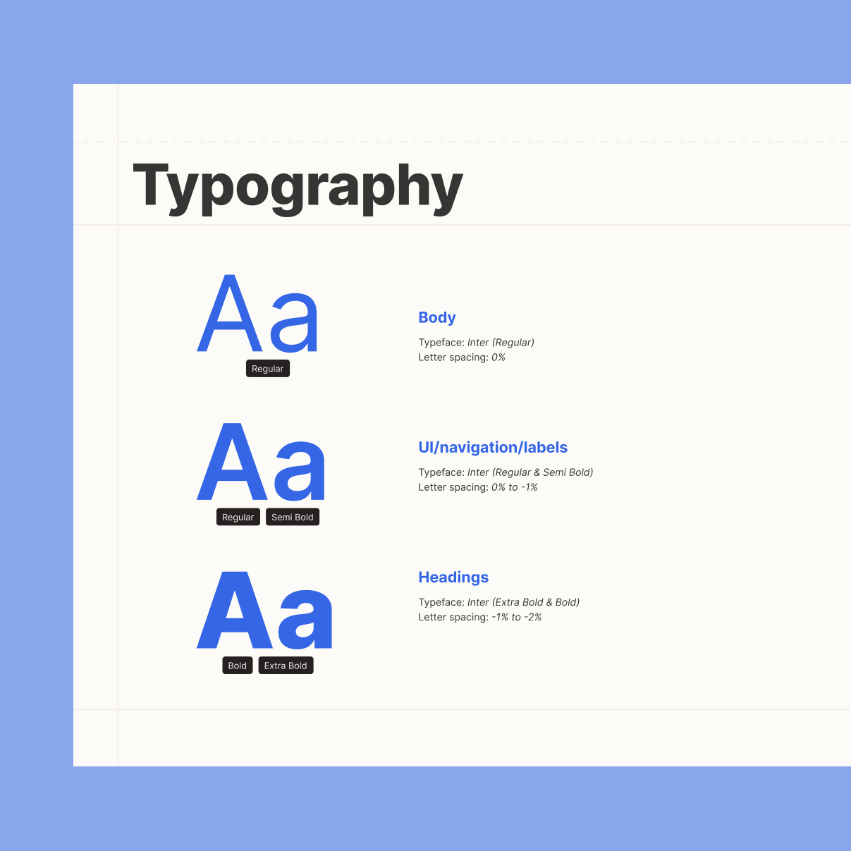
The goal was not to remove the technical expression completely, but to soften it. Blue remained as a signal of trust and reliability, while warmer neutral tones created a more human digital expression.
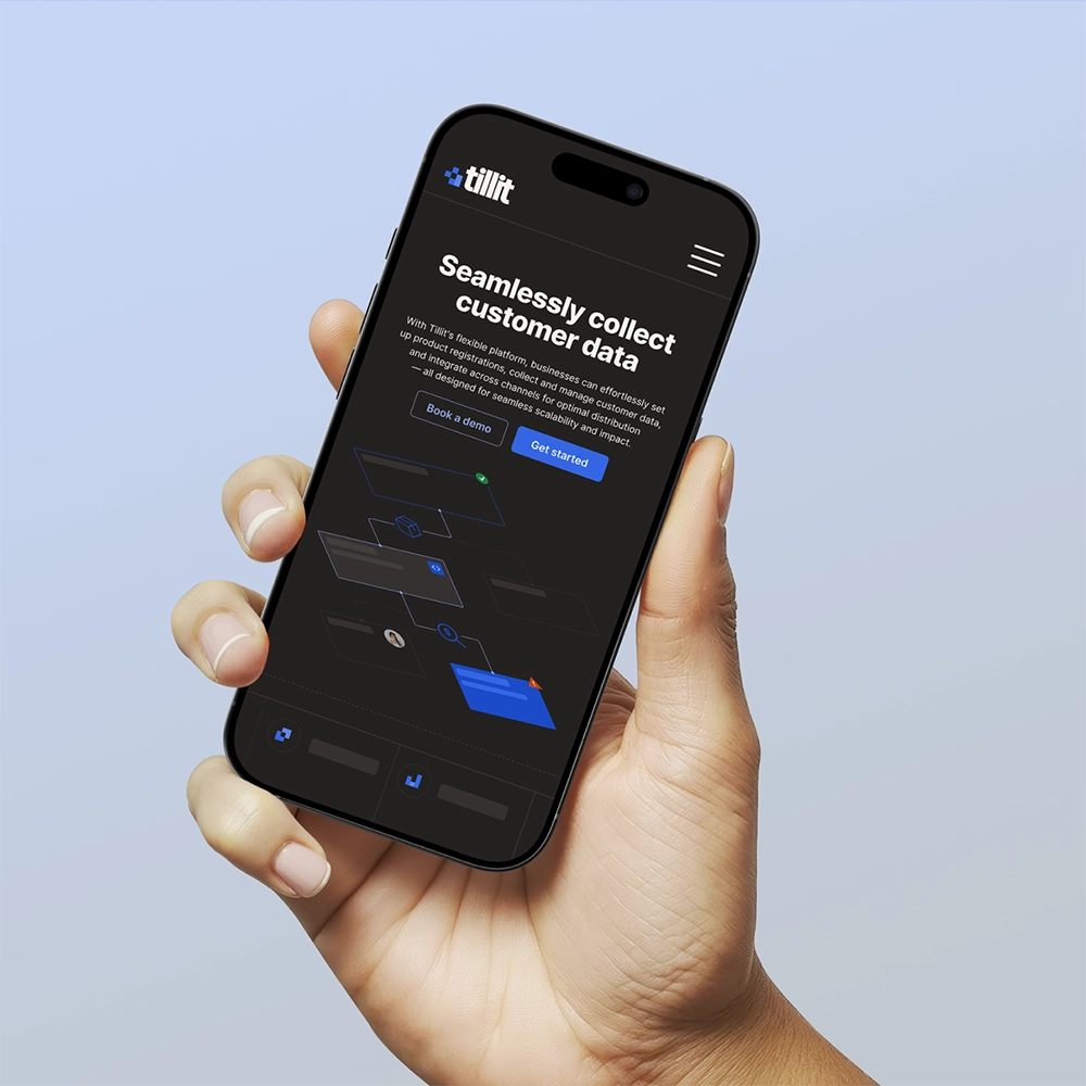
The color system was designed to work across both light and dark interfaces, allowing the identity to keep the same feeling regardless of context.
Inter is used throughout the identity for readability, accessibility and to keep the content in focus.
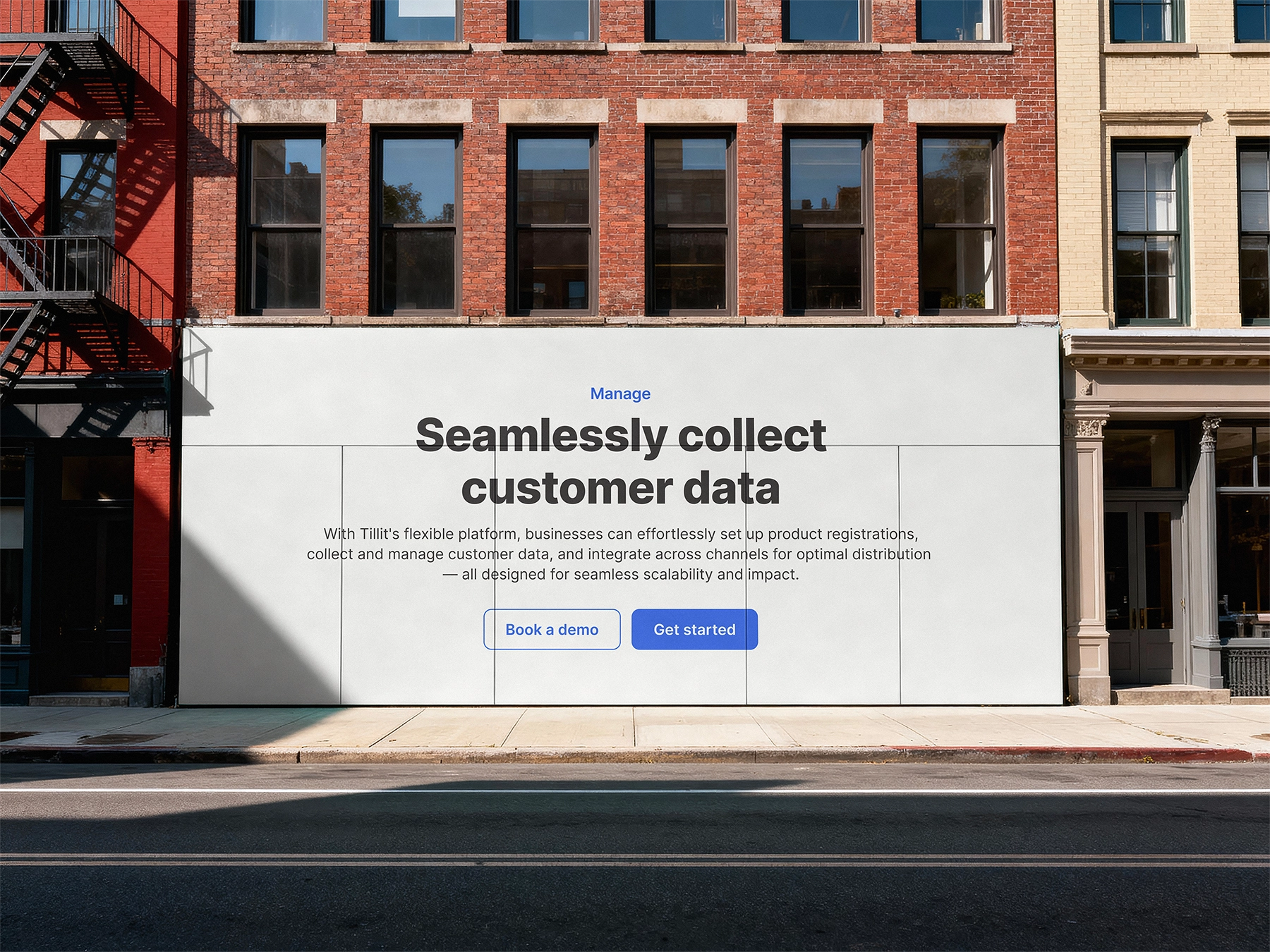
Bringing the system to life
The identity was designed to work both within the product itself and across presentations and communication materials. The result was a flexible visual foundation for Tillit that supports a complex platform while creating a warmer and more approachable user experience.
What happened next?
Today, the identity is used as the foundation for Tillit’s website. The service is used internationally and includes over 8 million registered products.
The project became a reminder that a strong identity can grow from discovering what already exists within a product - and bringing those qualities to life.