• UX/UI Design • 2025
Nordväg
Responsive e-commerce experience designed in Figma
From browsing to buying
Nordväg is a responsive e-commerce concept exploring how structure, interaction and visual hierarchy can guide users from first visit to purchase.
The challenge was creating a shopping experience that supported both exploration and decision making helping users compare, save and purchase products without interrupting their flow.
Different screens, different needs
Through a sitemap and analysis of established e-commerce patterns, I explored how users move from browsing to decision making. I identified two different user needs: desktop needed to support quick comparison and multiple choices, while mobile needed to prioritize clarity and flow.
Before moving into the visual design phase, the focus was on creating a clear information structure. Products needed space to stand out without making users search for their next step.
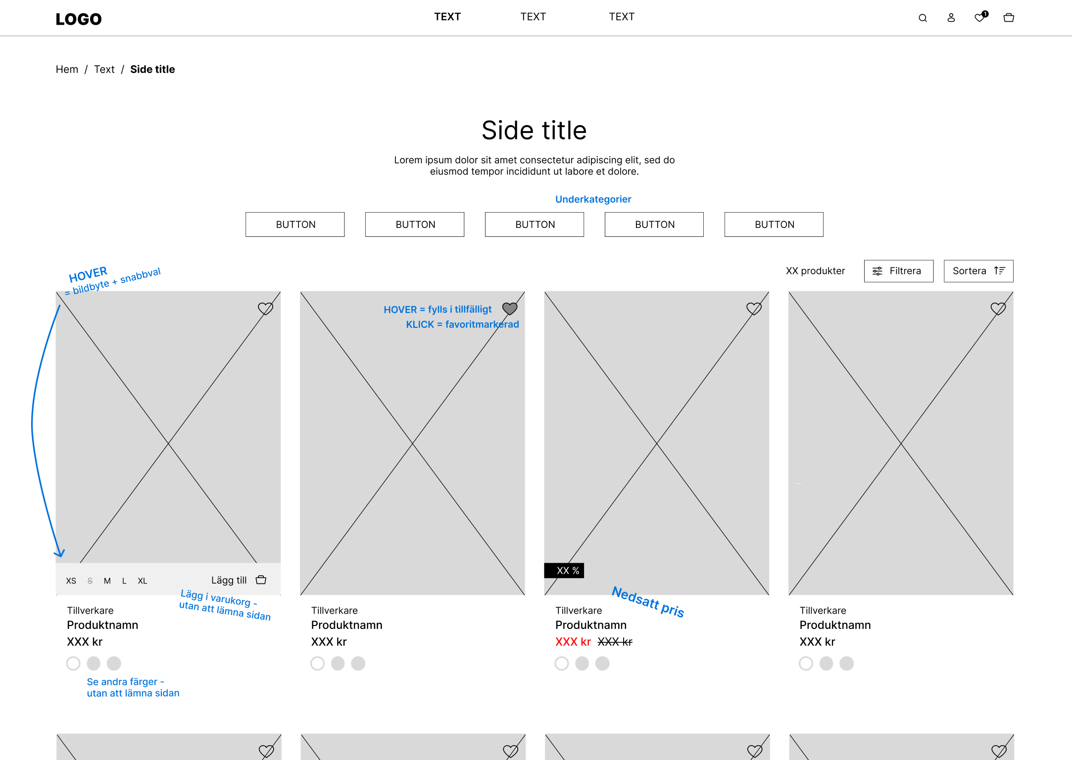
Wireframe and planned interactions for product listing.
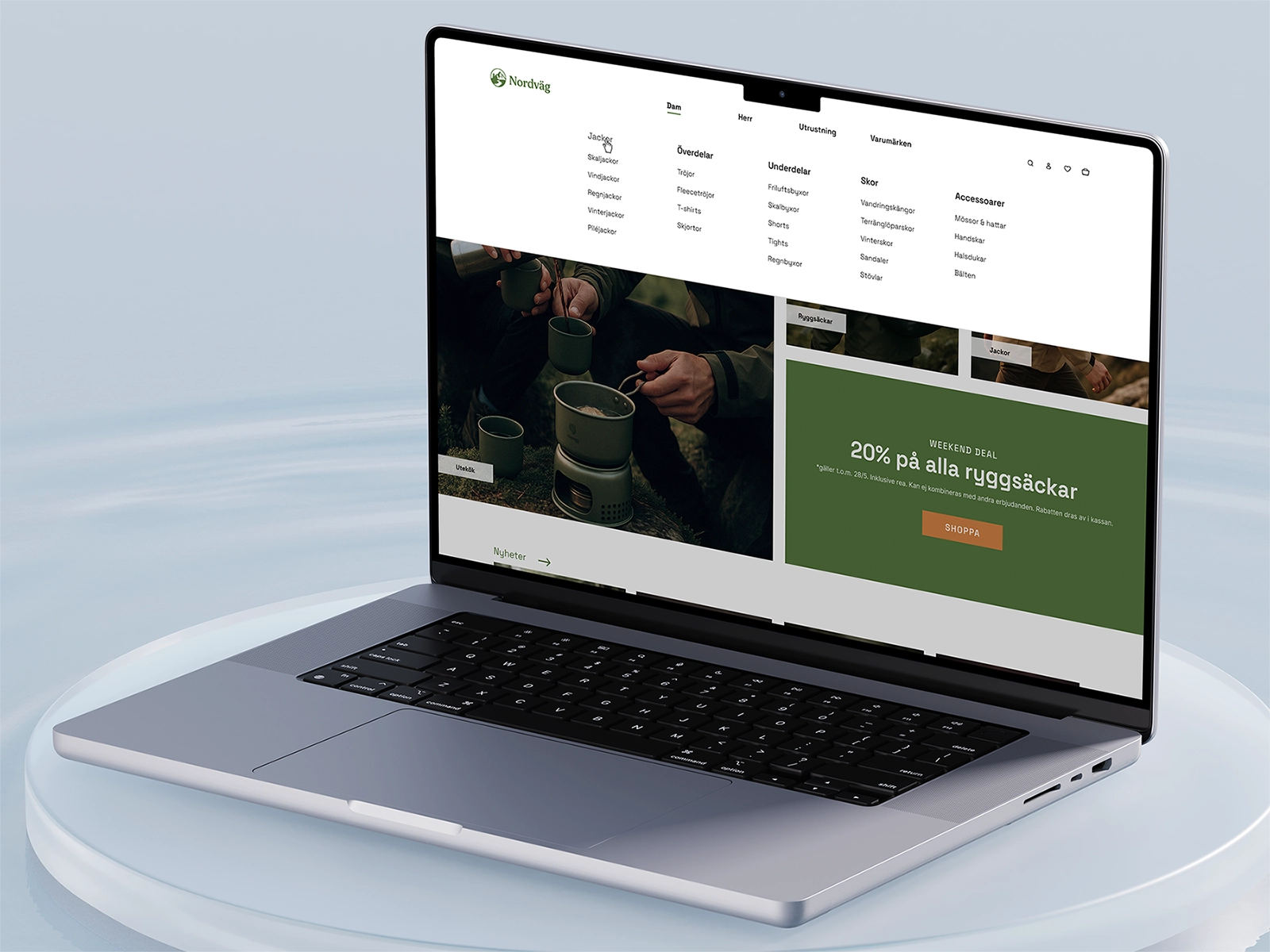
Keeping users in flow
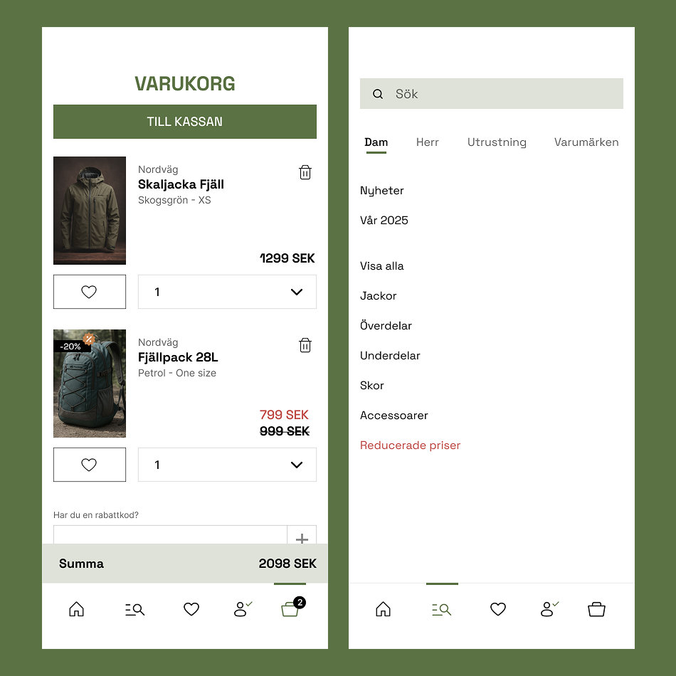
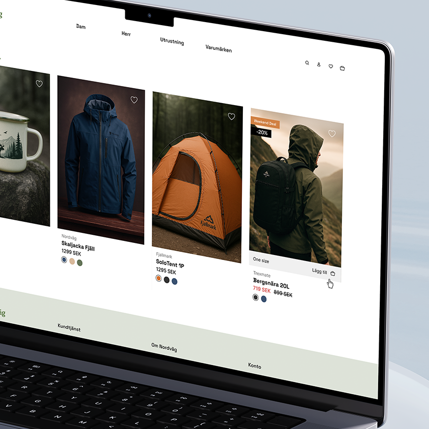
Desktop interactions were designed to support browsing without unnecessary interruptions. Instead of sending users to separate pages, actions like viewing the cart and saved products happen within the current context through overlays.
Product cards were designed to support quick decisions during browsing, allowing users to view options, save favorites and add products without losing their place in the journey.
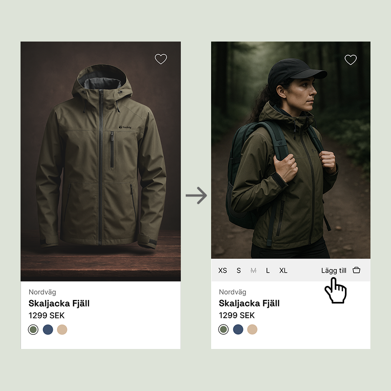
Quick product options and decisions directly from the product card.
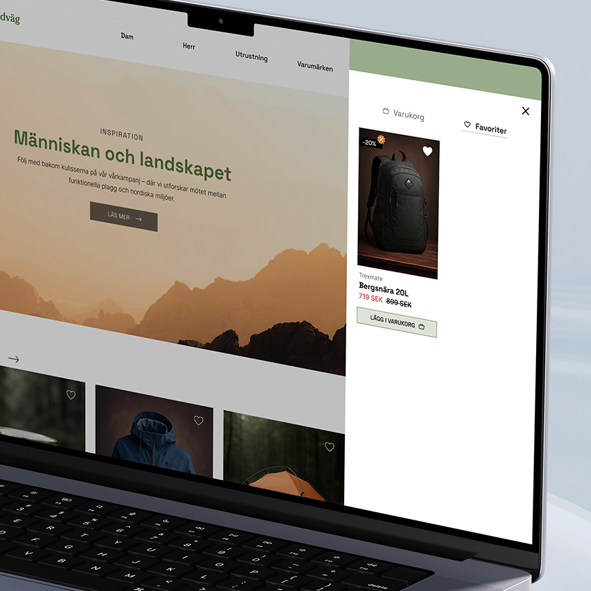
Cart and favorites stay accessible without interrupting browsing.
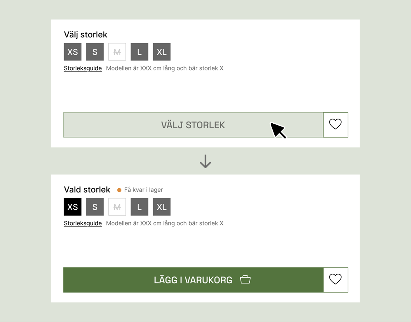
Interactive states guide users through required choices, providing relevant feedback only when it is needed.
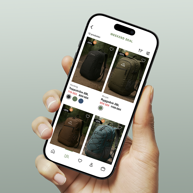
Less space, clearer choices
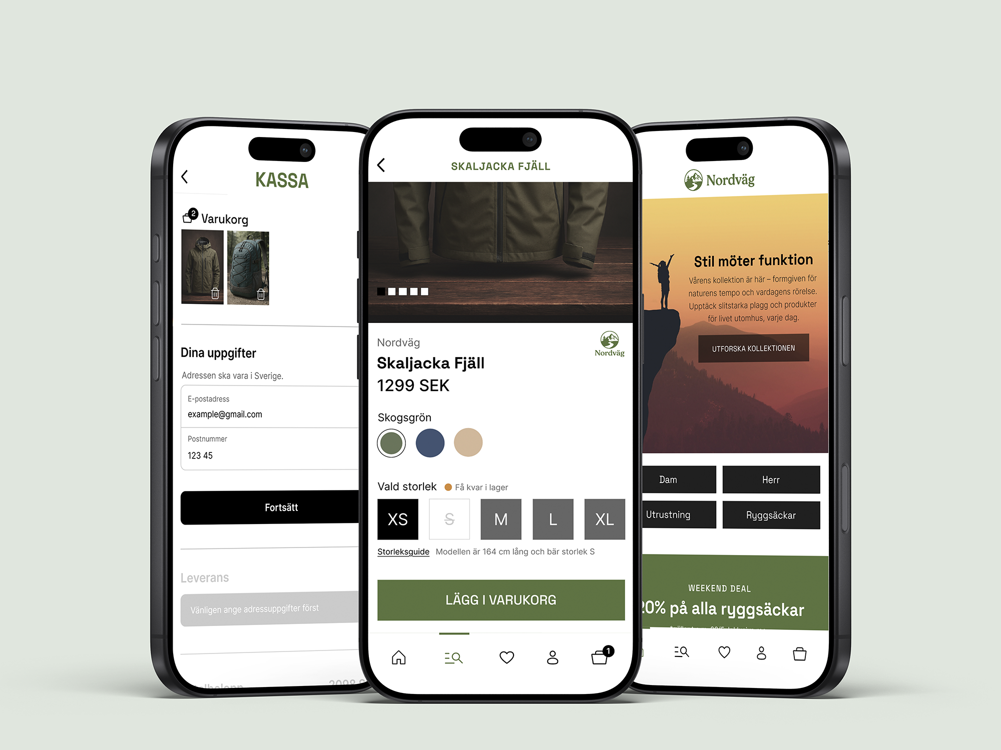
The mobile version was adapted around a different browsing behavior, where limited space required clearer prioritization and more focused interactions.
Instead of scaling down the desktop experience, interactions were redesigned for a smaller context. Cart, favorites and shopping menu were given dedicated spaces, while gestures and persistent navigation kept important actions accessible without overwhelming the interface.
Dedicated views create focused interactions on smaller screens.
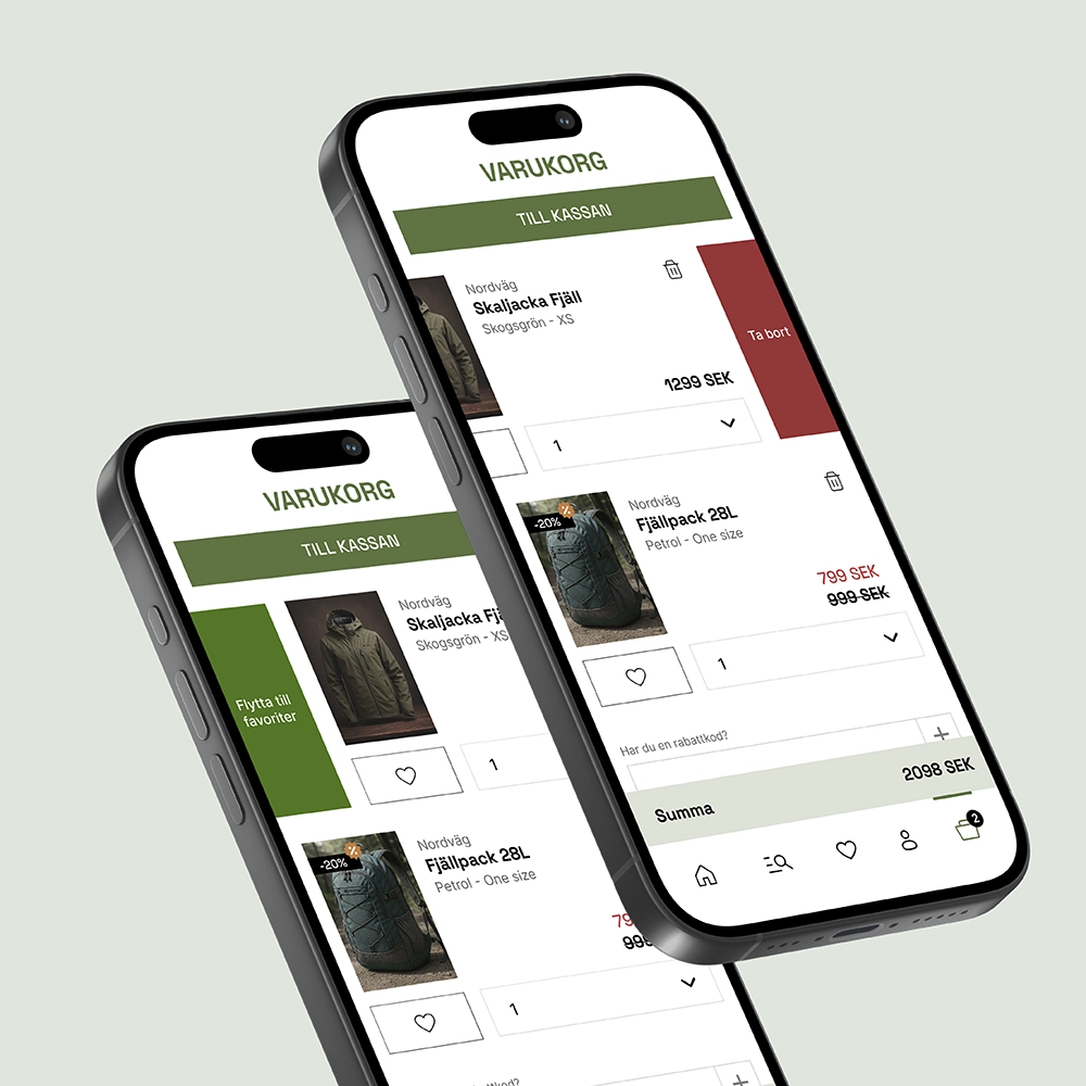
Secondary actions are hidden until needed, keeping the cart focused while still accessible.
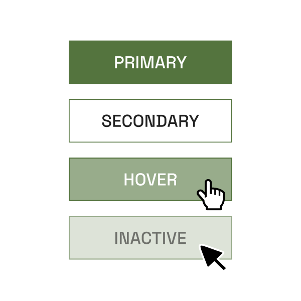
Every color has a role
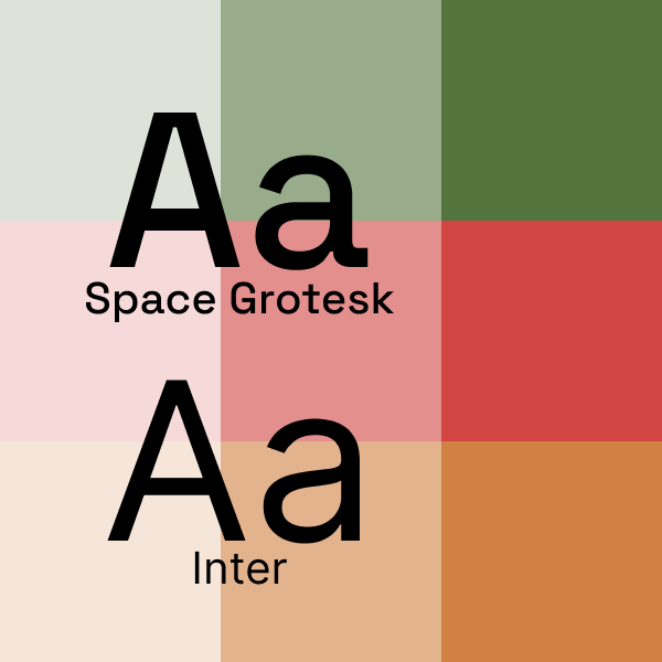
Nordväg’s visual system is built around functional color choices, simple typography and intuitive navigation.
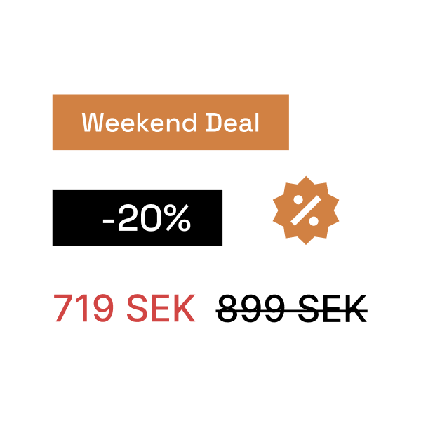
Colors are used to communicate function: green for the core identity, orange for campaigns and red for discounts.
From structure to experience
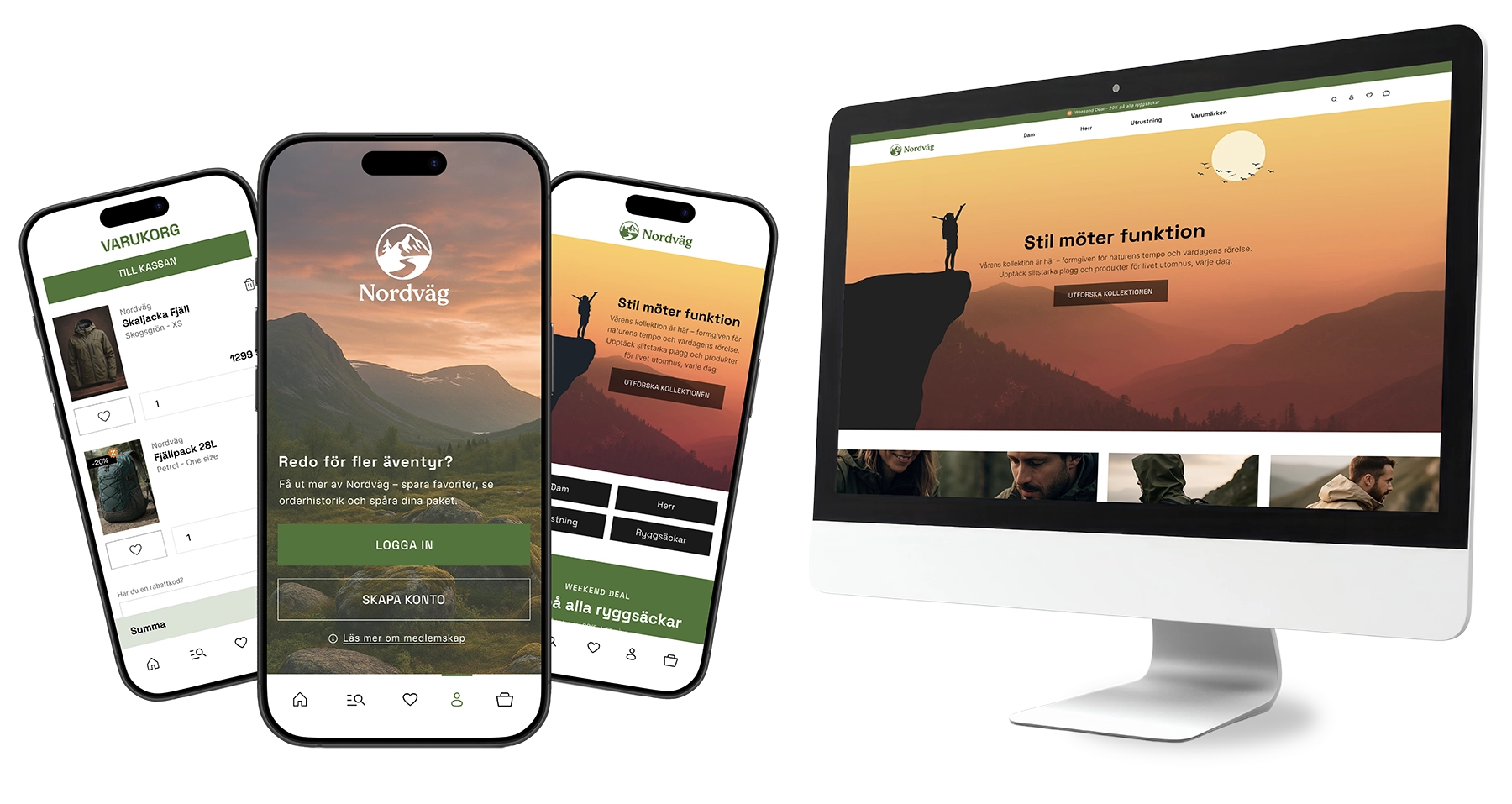
The result is two clickable prototypes demonstrating the webshop’s core flows from homepage to order confirmation. The solution combines structure, visual expression and interaction to create a clear purchasing experience across both desktop and mobile.
The project showed how small decisions affect the perception of simplicity. Clear flows and thoughtful components helped create an experience that felt both enjoyable and easy to use.
Demo
A demonstration of the prototype flow from homepage to confirmed order, including additional interactions.